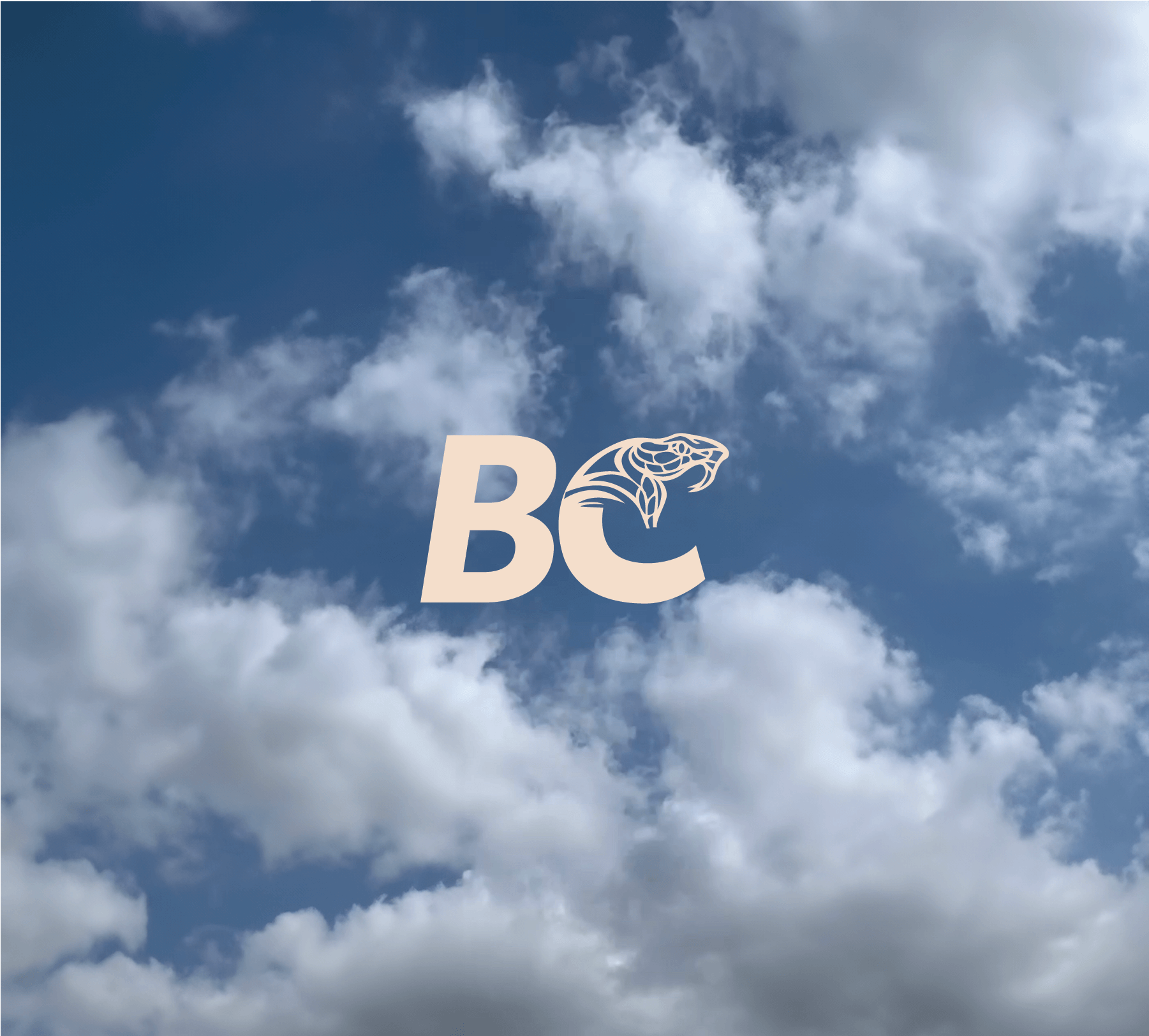
Bobby Cobra Co
Services provided
ART DIRECTION
BRANDING
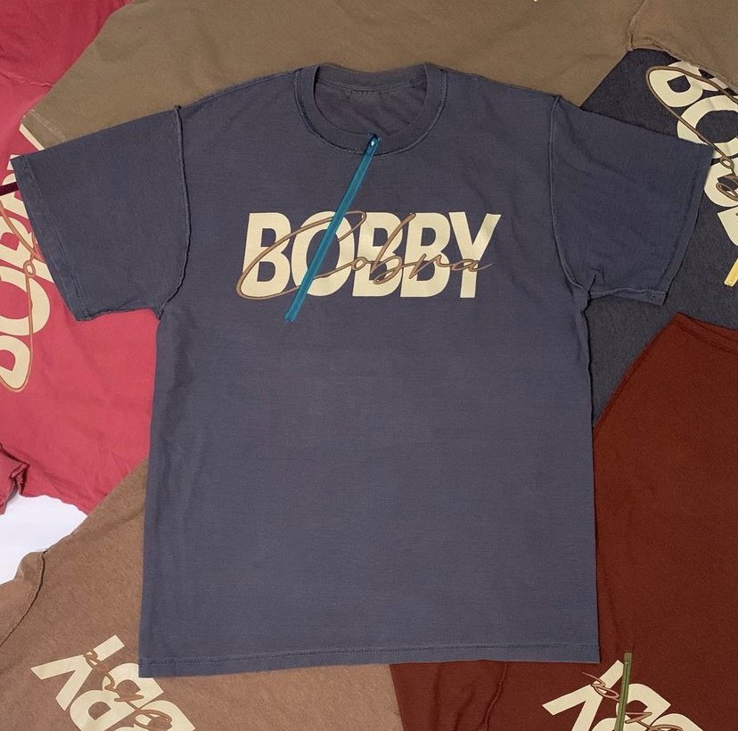
Brief: Bobby cobra tapped me to create an identity for an upcoming fashion brand that was geared towards petite women. Bobby Cobra needed a brand mark and word mark that would give much more meaning to its name and look.
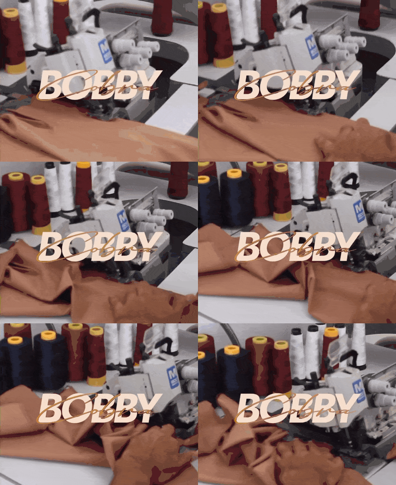
Solution: When "Cobra" was knocked out of its letterform, "Bobby" had to be readable. I chose a font that makes a strong statement through its boldness. Finding a script font that flows through in a snake-like fashion and is legible and sophisticated was the goal. In the "BC" brand mark, a snake's head appears out of the letter "C", giving the brand an edgy look.


